Binge
Binge is an iOS application designed to help users find and review restaurants. Users can create wish lists of places they want to visit and send recommendation lists to friends.
Role: UX Researcher and Designer
Deliverables: Design Requirements, Survey, Sketches, User Flows, Wireframes, UI Design with Sketch, Prototype with InVision, Interaction Design with Origami Studio

Process

My Process for this application began with a discovery phase, where I conducted research on the industry. I created a preliminary product statement with a list of features. I then began a research phase where I created a survey for the general population to complete about their current process of selecting a restaurant. I examined the feature set, UI patterns and completed heuristic evaluations on competitors.
During the wireframe phase I started to lay out the basic structure of the application. Once I added enough fidelity I began conducting user testing sessions by coming up with a list of questions and showing the beta version to users with InVision. Through several prototyping cycles I improved on the UI Design and will then deliver the UI assets to development. I will work with development throughout the production cycle and complete design Quality Assurance testing to verify that the designs have been implemented correctly.
Once the product is launched I will use qualitative and quantitative data to construct insights on the users experience of the product and will furthermore iterate on its design.
Research
There are over 1 million restaurants in the United States, with a revenue of $799 billion. In 2017, 75% of restaurants used social media as a platform for advertising. Restaurants were more like to use Facebook for advertising (92%) than Snapchat (16%) [1]. Yelp helps users find local businesses in their area. Although Yelp contains information about many restaurants, it also promotes hair stylists, mechanics and home services. Yelp has an 145 million average unique monthly users. 70% of page views come from a mobile device and application users view 10 times more pages than desktop users [2]. This data reveals that more restaurants are seeing the benefit of using social services to promote their business. The online perception and presence of a business is important for its growth in the current digital age.
Resources:
[1] 50+ Restaurant Industry Statistics for Restaurant Owners in 2017. (2017). Retrieved January 20th, 2018, from Toast, https://pos.toasttab.com/blog/restaurant-management-statistics
[2] 63 Yelp Statistics and Facts Retrieved January 20th, 2018, from DMR, https://expandedramblings.com/index.php/yelp-statistics/
Design Requirements
Functional:
-
Provide users with a wide range of restaurants in the area
-
Each restaurant has a detail view that contains: gallery photos, contact information, reviews and the menu
-
Search for restaurants nearby or in a specific area by price, type of food and tags (atmosphere, dynamic, etc)
-
View restaurants in a List or Map View
-
View social feed of friends
-
Create recommendation Lists
Technical:
-
Usability
-
Clarity of information
Product Research - Yelp


Yelp - Nearby
-
The Nearby navigational section is the default landing page when the user opens up the application. This section contains clickable icons on the top to show the user several search offerings including: restaurants, bars and hair salons.
-
The "Find the Best Businesses in Town" seems misplaced, giving me information I do not expect, making it feel like an advertisement. In addition, the "Hide" link on the right side furthermore confirms my suspicion that this is paid space.
-
The homepage also features one restaurant near me and a list of Yelp events.
-
The moment I select an option from the top icons or press search I am transported to the next part of the navigation.
Yelp - Search
-
In this section, I can toggle between a list and map view, filter my results or search for particular key words.
-
Several advertisements are placed sporadically throughout the list and it does not contain a continuous scroll. Users must select the "Browse More" option when the list exceeds 40 values.
-
Price is visually separated from the other pieces of information which makes it easy to scan; however, the values are set to a dollar range from $ - $$$$. This does not reveal quantitative information about the expected prices.
Yelp - Me
-
When the user navigates to the "Me" section, they are prompted to Log In using an email address and password. Using the desktop version of this application, a similar pop up appears; asking the user to create an account. Although the user downloaded the application, Yelp wants more information, either an email address or Facebook account. This screen disrupts the user flow and even hides the bottom navigation, requiring the user to select Cancel in the top left corner if they do not wish to log in or sign up.
Yelp - Activity
-
In the Activity Section, Yelp shows reviews that have recently been added.
-
It seems that Yelp is using my location to show reviews of restaurants in my area.
-
The "Review of the Day" is the first item on this page; however, Yelp does not explain what this title means. "Review of the Day" is not clickable; therefore, I am assuming that this review comes from an active user and was given positive feedback from the community.
Yelp - More
-
In the "More" section, the user is still prompted to Sign Up or Log In, without an indication what benefits they will receive from giving Yelp their email or Facebook.
-
Here, the user can view bookmarks of restaurants that were previously saved. This feels misplaced and should be in the "Me" section, if they were given access without creating an account.
User Research
Goal:
Understand the current process of how individuals choose a restaurant and the importance of certain characteristics.
Method:
Create a survey that contains open ended questions and likert scales for qualitative and quantitative information.


Pre Test Questions:
-
How many times a week do you get food out (restaurant, takeout, etc)?
-
How do you currently find restaurants to go to?
-
Rely on friend recommendations, google, reviews?
-
-
What qualities do you look for when you search for a restaurant?
-
On a scale of 1 - 10, how often do you like to try new restaurants?
-
What digital services do you use to find places to eat?
-
Google search, Yelp
-
Task:
Create a list of the qualities you look for when you are searching for a restaurant. Rank them in order of importance.
Results


-
20 Participants
-
65% visit restaurants a few times a month, 30% visit a few times a week, 5% visit a few times per year
-
70% choose a restaurant at least several hours before going
-
When choosing a restaurant:
-
80% rely on suggestions from family and friends
-
65% complete an online search
-
60% use apps (ex. Yelp)
-
-
Most important qualities when choosing a restaurant (ranked):
-
Type of Food
-
Location
-
Price
-
Menu
-
Atmosphere
-
Cleanliness
-
Portion Size
-
-
"It's accessible- really easy to use my phone or computer pretty much wherever I am to search a site or app for a restaurant"
-
"I wish that it were easier to be more adventurous"
"I have to conduct a lot of my own research" - User
Site Map

-
This site map depicts the main sections of the application. In the Home view, users have access to the map and list view of restaurants nearby. The user can also filter and search.
-
In the Wishlist section, users can create, organize and remove their categories. They can arrange the restaurants within the list and share it through social channels.
-
In the Social feed, users can see popular restaurants that were recently searched and reviewed. They can see recommendations from friends and highly rated restaurants.
-
In the Profile section, users can customize their name, description and social channels. They can see all of the restaurants they favorited and reviewed.
Wireframes


-
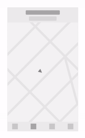
Initial wireframes include a bottom bar navigation system to quickly access the main elements indicated in the user flow. The landing home page would contain a list of restaurants near the users' location. A toggle near the header would allow the user to switch between a list and map view.
-
The map view includes an indicator of the user's location and clickable pins that represents restaurants.
-
The profile page would include: a list of previous visited restaurants, along with any written reviews and ratings and a wish list feature.
Design Version 1


-
The Home page shows restaurants nearby, allowing users to toggle between a list and map view. Users can preview information about each restaurant such as: its type of cuisine, price per person, star review rating and reveals more information when the CTA is pressed.
-
The Filtering option allows users to control the price, type, location and tags associated with the establishment (including casual, romantic or trendy).
-
The map view includes an indicator of the users' location and clickable pins that represents restaurants.
User Feedback:
-
Users wanted to find a restaurant based on their location, so most users immediately selected the map option.
-
The name of the restaurant was only visible after the user tapped on the pin.
Insights:
-
Explore other List to Map navigation options.
-
Include the name of the restaurant underneath the pins so users can scan the map.
-
Users enjoy going to restaurants they have already been to before. Therefore, I would like to include a "favorite" feature where users can quickly find restaurants they have already been to and enjoyed.
-
For version 2, I want to improve upon the map and list interaction and brand the overall visual look of the app.
"Filtering my search based on the top rated restaurants in my vicinity helps me in scouting for the best options"
- User
Design Version 2


"I usually go to restaurants I've already been to before so I know what to expect"
- User
-
Exploring other applications, I found that a common pattern is to include a list and map option in the same view. I wanted to incorporate a similar visual design; here the map takes up the majority of the screen by default and when the user scrolls up the list takes over the view.
-
I included the names underneath the pins, since each pin represents a different restaurant.
-
From user research, I found that many users enjoy going to a favorited restaurant frequently; therefore, I included an indicator on the pins for these restaurants.
User Feedback:
-
Users could not identify what would happen if they selected the filter icon in the top right of the map.
-
After a user selects a restaurant they stated that they wanted more information about it, specifically its menu. If the user was interested in going to this place they stated they would want to know how to get there.
Insights:
-
The filtering icon might not clearly represent its function and it may be too disjointed from the restaurant options. Update the filter option to have a stronger association with the list of restaurants presented.
-
The selected restaurant on the map view should have a directions option.
-
Create a stronger association between the social recommendations and the restaurant.
User Flow

Design Version 3


-
From the last round of research I found that people were unaware of the filtering feature. I moved the filtering mechanism closer to the results and increased its visibility.
-
I promoted the several filtering options by having the options presented to the user.
-
Directions and the Menu are now accessible to the user when they select a restaurant on the map. Clicking on the detail card will bring the user to the detail state of that restaurant.
-
Users can add restaurants to their Wishlist and can manage and create new categories. Users can send their friends their Wishlist categories by selecting the 'More' option beside the title of the section. They can also edit the name of the category, delete it or merge it with another one.
-
Users can recommend particular restaurants for their friends by selecting the 'Share' option on the detail page.
-
On the Social page the user can see trending restaurants and places friends have liked or recommended for them.
Interaction Design
-
This interaction shows how the map pins loads on the screen and how the detail state appears after the user selects a pin.
-
When the user selects a restaurant from the map, the pin pops into the selected state and the detail drawer appears from the bottom of the screen. When the user clicks away the drawer disappears and the pin goes back to its unselected state.
Design Style Guide

What I learned and the next steps...
-
Initially I created the UI designs following iOS components. Throughout this iterative cycle I created custom components to produce a unique look and feel.
-
Completing several rounds of research brought upon insights that I incorporated in my design process. Following this iterative pattern I discovered features that users would be interested in and improved the experience of the application.
-
My next steps would be to further define the interaction design, place the designs into Zeplin for development handoff and work with Engineers to scope out their timeline for implementation.
More Work


© 2021 by Angela Delise