Bus Tracker
Redesign of the NYC Bus Tracker application to improve its usability and design. By conducting heuristic evaluations and usability studies on current design, the flaws are highlighted and insights are incorporated into a modern version.
Role: UX Researcher and Designer
Deliverables: Design Requirements, User Stories, Sketches, Personas, Interviews, Heuristic Evaluations, User Flows, Site Map, Wireframes, Design made with Adobe Experience Design (XD)

Research
According to the New York City MTA, it has 5,748 buses for 2.5 million people to take on an average weekday in 2015 [1]. The MTA has a tremendous amount of passengers and therefore, the demand for this service is high. Currently, the MTA Bus Tracker application has between 100,000 to 500,000 downloads on Google Play [2]. I purpose a redesign of this application that would improve its functionality and usability.
Sources:
[1] http://web.mta.info/nyct/facts/ffbus.htm
[2] https://play.google.com/store/apps/details?id=com.jmd.busservice&hl=en
[3] http://web.mta.info/nyct/facts/ridership/
Current Design: NYC Bus Tracker


User Research: Interview and Heuristic Evaluations
Interview Questions:
-
How do you navigate around New York City?
-
Do you use public transportation? If so, what types?
-
Have you ever rode on an MTA bus?
-
If so, can you describe your experience finding the bus and route to go on?
-
What was your experience on the bus?
-
-
Have you ever used an application to navigate the MTA system? If so, which ones?
-
On a scale of 1-5, 1 being extremely unsatisfied and 5 being extremely satisfied, how would you rate your experience using those applications?
-
Did you think something could have been improved with those applications? If so, what aspects?
-
-
What information would help your traveling with the MTA?
[Show user the NYC Bus Tracker application]
-
Does this application look familiar to you?
-
Have you ever used this particular application?
Usability Test on Current Design:
[Following the Talking Aloud Protocol]
-
What do you want to click on next?
-
What do you expect will happen if you click on that?
-
Does this page match your expectation?


Participants:
-
5 individuals
-
2 used this application before
-
5/5 would use an application like this
Interview Insights:
-
What information would help your traveling with the MTA buses?
-
What buses are nearby
-
Time of arrival of bus
-
Note delays
-
How long it will take to get to destination
-
-
What features would you want in this design?
-
View multiple bus arrivals at same time
-
Automatic refresh of bus information
-
Heuristic Evaluation Insights:
-
Visibility of system status: poor
-
Lack of error messages
-
Current error messages do not make sense
-
-
Error prevention: poor
-
Homepage is confusing, users did not understand how to search on the homepage
-
Directions were not clear
-
-
Match between system and the real world: poor
-
Displays useless information to the user
-
-
Consistency and standards: poor
-
Certain things are clickable and do not look it
-
Navigation issues
-
Personas

Amber - Expert Bus User
-
Takes the bus frequently
-
Knows route number
-
Knows which stop to get on and off
-
Wants to know time of arrival

Jason - Intermediate Bus User
-
Knows where he is
-
Knows where he wants to go
-
Want to search for buses by address

Emily - Beginner Bus User
-
Does not know which bus routes are nearby
-
Does not have exact address of where she needs to go
-
Uses nearby stops to look at route options
Functional Design Requirements
Search for a bus:
-
By Bus Number
-
Type in bus, select your stop and know time of arrival
-
-
By Address
-
Put address in, where you are (current location) or type in and destination
-
Which buses are best and time of arrival
-
-
By Nearby Stops
-
See which bus stops are nearby and routes
-
Select the stop to see how far away the buses are
-
Add address and then best route will be highlighted (+)
-
Other Features:
-
Save your favorite bus stops
-
See how far away the bus is from the stop in minutes
-
View multiple bus routes at one time
-
-
Get information about delays
User Stories
Home:
-
As a user I would like to view a list of bus routes nearby when I open the application.
-
As a user I would like to see the bus routes nearby on the map so I can see where the bus routes are in relation to where I am.
-
As a user I would like to see where the bus stop is and an indication of the bus route path.
-
As a user I would like to know the name of the bus id, its destination, where the stop is located, the stop distance from my current location and its estimated time of arrival.
-
As a user I would like to know if I have favorited this bus route before.
-
As a user I would like to know if the bus has any current delays.
Search:
-
As a user I would like to search for a bus route by address or bus id.
-
As a user I would like the application to save my previous searches for quick access.
Saved:
-
As a user I would like to save my favorite bus stops and routes.
-
As a user I would like to easily access my saved favorites.
Initial Site Map
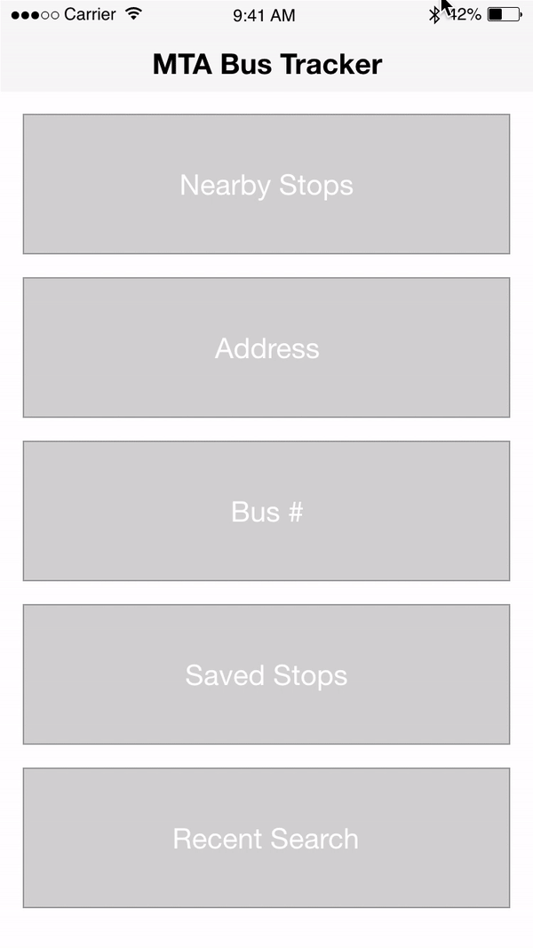
Initial Wireframes


User Feedback:
-
The Homepage contains several options for users, but they cannot retrieve previous search results. If an individual completes a search without saving the particular stop, how can they retrieve that information again? Can a 'Recent Search' be implemented?
-
For Nearby Stops is there a way to place information about buses traveling in both directions in their own row? The direction is confusing since some buses travel in multiple directions, such as north and east
-
For the selected bus state, can this page be streamlined to contain information in a more concise way? I did not realize I had to click on 'Show Route' to see all of the stops
Insights:
-
Include a 'Recent Search' option
-
Update organization of content for nearby stops to clearly indicate direction of bus route
-
Explore other options for the hierarchy of information on the selected bus detail page
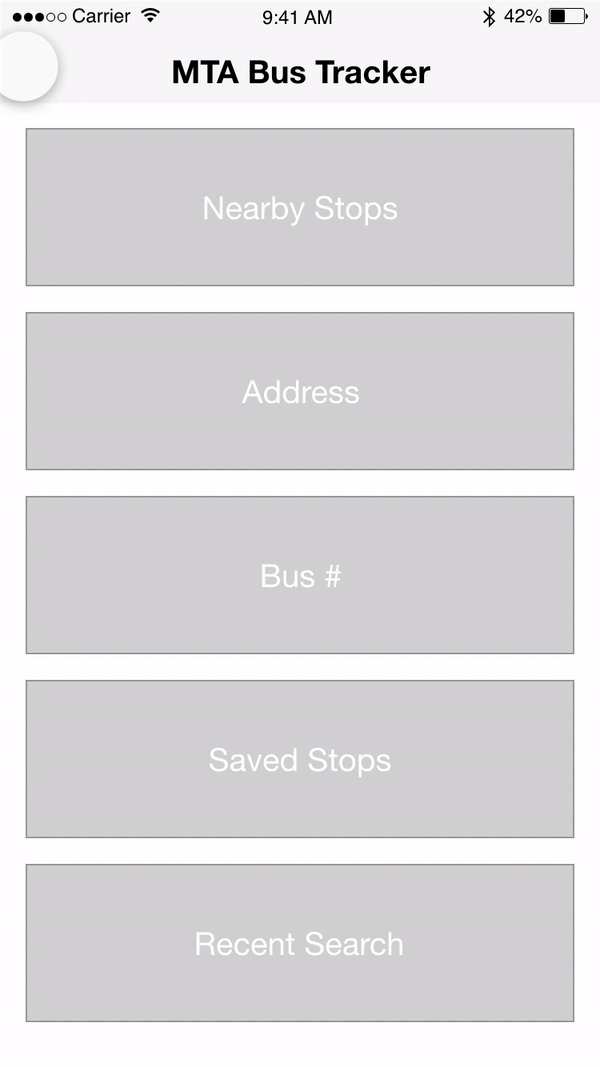
Wireframes Version 2


User Feedback:
-
Not sure how I should begin using this app. If I already used it before I might go to Saved Stops or Recent Search, but if I never used it before I would probably choose Nearby Stops
-
Sometimes the lighter text is difficult to read
-
I like that there is a notice of delays for the lines
Insights:
-
Homepage contains too many options at the beginning that may be difficult for the user to make a selection. Streamline the homepage by presenting users with information right away
-
Update style guide to adhere to accessibility guidelines in terms of color contrast and interaction design
Initial Interaction Design
Nearby Stops:
-
Use current location
-
Show user bus stops nearby
-
When selected more information about bus route appears
-
start and destination
-
shows all stops
-
service status: good/delays
-
save stop
-
show where buses are along the route
-
Bus #:
-
User types in Bus #
-
Include bus information
-
start and destination
-
service status: good/delays
-
list of all stops on route
-
-
Select particular stop from list
-
indicates how far away the bus is in minutes
-
save stop
-

Address:
-
User types in starting and ending address
-
Show possible routes organized based on arrival time to destination
-
User selects route
-
shows distance to stop
-
indicates several buses on route
-
shows bus stops when selected
-
shows distance to destination
-
Site Map Version 2
-
From several rounds of user testing, I realized the importance of showing information to the user as quickly as possible. In the initial designs, the user had to select their search method at the beginning of the experience. If the user's goal is to understand bus information as soon as they open up the application, the data should be available on application landing.
-
If the user wishes to search they would have that option available in one search experience, instead of indicating how they wish to search.
User Flow
UI Design


-
The goal of this redesign was to improve the navigation and streamline the process of acquiring information. Now on application landing, the user is presented with a map and list of nearby stops and routes, organized by which stops are the closest. Each listing indicates the direction of the bus route, where the stop is located, time of arrival and a notification if there are delays. Saved routes are also shown with a star indication.
-
The user can search for a particular destination or bus route by selecting the search bar. When the user taps on this area the search view appears modally. On search landing the user is shown a list of nearby routes to access their detail pages quickly. The user is also shown their recent searches. After the user inputs a search they are presented with a list of the stops that are close to that destination. By canceling this view the user is brought back to the home page.
-
The hamburger menu contains the users settings and a FAQ page. The settings page will include links to notification and location permissions as well as the version number of the application.
-
On the home page, the user can quickly access their saved routes and filter through the list with several options.
Interaction Design
Design System

What I learned and the next steps...
-
Although I wanted to redesign this application for my own personal use, there are other kinds of users I had to be aware of when producing a universal design. Through interviews I realized the pain points individuals that do not normally use public transportation face and addressed these issues in my design.
-
By testing this design several times I was able to learn more about what features users care the most about and focus on the interaction of those elements.
-
In the future I want to continue to user test on this design and iterate based on feedback to enhance this experience.
More Work


© 2021 by Angela Delise